Understanding Color Expectations
Color is one of the most important aspects of every wallpaper project. Because each order is custom printed specifically for you, there are several factors that influence how your finished wallpaper will look. The information below explains what to expect before placing your order.
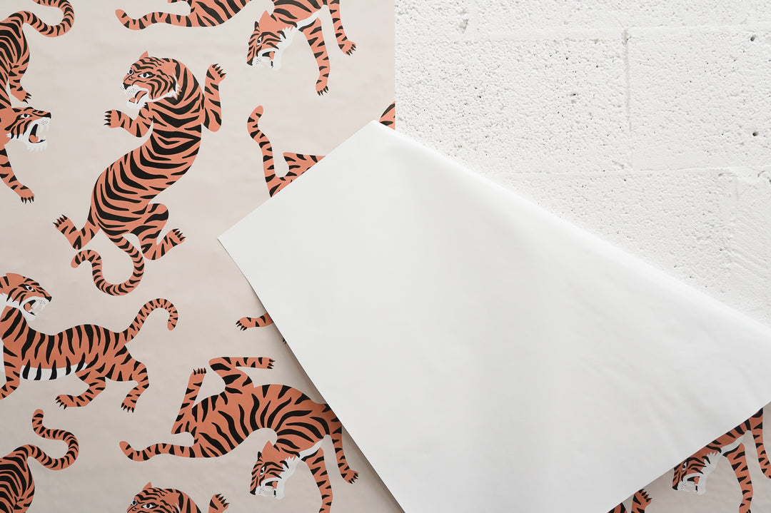
Listing Photos
Our listing photos are intended to provide an accurate representation of each design; however, they should be considered an approximation of the final printed product.
Every wallpaper is custom printed, and the finished colors may vary slightly from what you see on your screen due to differences in monitors, devices, printing materials, production conditions, and even personal expectations of how a color should appear. Perception of color can vary from person to person, and what looks perfect on one screen or in one setting may appear slightly different in another.
We strongly recommend ordering a sample before placing your full wallpaper order. A sample allows you to see the true color, material, texture, and finish in your own space and under your specific lighting conditions, helping ensure the final result meets your expectations.
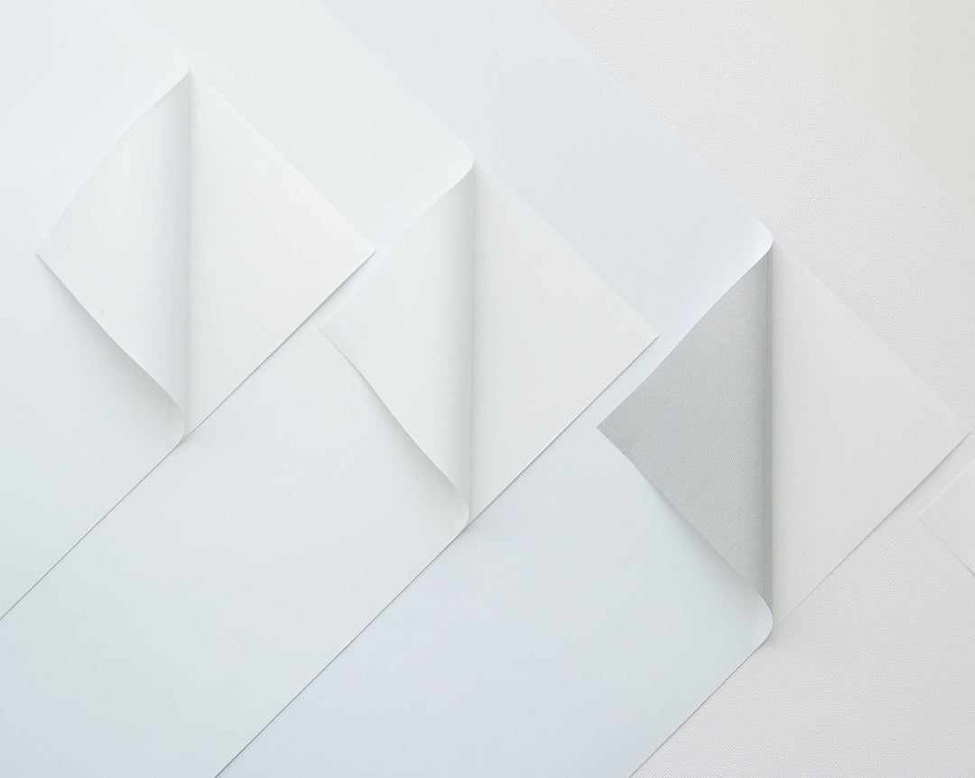
Different Materials = Different Colors
Each of our wallpaper materials has its own composition, base color, texture, sheen, and finish. Even when printing the exact same artwork using the same printer, these characteristics influence the final appearance of the colors.
If you are unsure which material is best for your project, we highly recommend ordering samples of each material you are considering.
For the best color consistency, always order your sample and your final wallpaper using the same material.

In this picture you can see how the same print looks in different materials: to the top left Long Term Peel&Stick, top center Traditional Non Pasted, top right Removable Peel&Stick, bottom left Traditional Canvas Non Pasted, bottom center Canvas Peel&Stick, bottom right Traditional Pre-pasted.
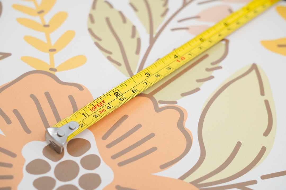
Lighting conditions
Lighting has a significant impact on how wallpaper colors appear.
Natural daylight, warm lighting, cool LED lighting, room orientation, surrounding paint colors, flooring, and furnishings can all influence how the wallpaper is perceived once installed.
Light-colored wallpapers are especially sensitive to these environmental changes.
We always recommend evaluating your sample in the room where it will be installed and under the lighting conditions it will experience throughout the day.

In this picture you can see how the same print looks in different lighting conditions.
Custom Digital Printing
Every wallpaper we produce is printed on demand specifically for your order. Unlike mass-produced wallpaper, we do not print large inventory batches.
To maintain the highest print quality, our production equipment undergoes routine maintenance, color calibration, software updates, replacement of wear components, and occasional equipment upgrades. We also receive new batches of inks and wallpaper materials over time.
Because of these normal production processes, exact color matching between different production runs cannot be guaranteed.
Reorders & Color Consistency
If you anticipate needing additional wallpaper in the future, we strongly recommend ordering enough material to complete your project at the time of your original purchase.
We guarantee color consistency only for reorders placed within 12 months of the original production date using the same wallpaper material.
Reorders placed after 12 months may show slight or even noticeable color differences due to normal changes in printer calibration, equipment maintenance, ink batches, wallpaper batches, and production improvements over time.
These variations are an expected characteristic of custom digital printing and are not considered manufacturing defects.
Samples vs. Final Orders
Samples are the best way to evaluate color, material, texture, and finish before placing your full order.
Because printing conditions naturally evolve over time, slight color differences may occur between a sample and a future wallpaper order.
For the highest level of color consistency, we recommend placing your full wallpaper order within 12 months of receiving your sample and selecting the same wallpaper material.
Color Matching for Interior Designers
Our production process is 100% digital printing.
While we are happy to perform color customizations, we do not offer Pantone matching or exact paint color matching services.
Color adjustments can be made using CMYK, RGB, or HEX color values whenever possible.
If your project requires customized colors, we strongly recommend ordering a sample for approval before placing your full wallpaper order.
Paint Colors & Wallpaper
Paint colors suggested alongside our wallpapers are intended as coordinating recommendations only.
Because wallpaper and paint are manufactured using completely different production processes, we cannot guarantee that any paint color code will perfectly match a wallpaper.
If an exact paint match is required, we recommend ordering a wallpaper sample and matching the paint directly with your paint supplier.
Important
• Listing photos are an approximation of the final printed wallpaper.
• Different wallpaper materials produce different color results.
• Lighting significantly affects the appearance of wallpaper.
• We recommend ordering enough wallpaper to complete your project at one time.
• Color consistency is guaranteed only for reorders placed within 12 months using the same wallpaper material.
• Reorders placed after 12 months may show noticeable color differences.
• Color variations caused by normal production changes over time are expected and are not considered manufacturing defects.